
UI / UX design
Unique-United – Accessible platform
This platform is intended to give people with physical and mental disabilities the opportunity to search for and book offers for training, events, travel and jobs independently and without barriers.
Founder Louis Kleemeyer has had a learning disability himself since birth. As a result, he has been an active volunteer for the social integration of people with disabilities for many years and has also supported the Special Olympics World Games 23 since 2022.
The platform is currently still under development.
Methods & services
Analysis | Concept development | User flows | User journey | Wireframing | Prototype/click dummy | UX/UI design | Design guide | Project management
Tools
Adobe XD | Figma | Miro | Google Meets
Challenges
Barrier-free access for people with physical and mental disabilities
Simple search function for four different offers and different requirements
Simple structure and quick overview of topics and offers
Goals
Users should be able to find offers quickly and easily
Users should feel safe and understood
users should have the feeling that they can move freely around the site
Project phases


Step 1:
Analysis
In our first meeting, Louis and I did an analysis for the implementation of the Unique-United platform. We talked about his motivation and how the platform should develop in the future.

User analysis
In a target group analysis, we identified the following two target groups for the platform:
Providers who offer training, travel, events and jobs for people with disabilities.
Users who have a physical or mental disability and are looking for services that meet their needs.

Competitor analysis
I was surprised at how little competition the Unique-United platform has. There are no or only limited platforms and websites that enable people with physical AND mental disabilities to search for and book offers independently.
Job portals such as inklupreneur and myability were identified as indirect competitors. However, both sites are not 100% accessible and do not offer the option of filtering according to specific criteria and needs.
Step 2:
Strategy and concept

In our analysis meeting, Louis and I worked out two final strategy questions:
How should the platform be structured so that handicap users can quickly and easily find out about offers and register directly?
What must the platform be able to do so that the provider can quickly and easily create and publish offers on the site?
We focus primarily on users with a disability, as they should use the platform as often as possible.
But the provider should also be able to find its way around quickly and easily in order to provide users with a wide range of offers.

Functions
A complex platform can offer an infinite number of functions and options. It is important to prioritize the functions so that they do not exceed the budget and users are not overwhelmed by the range of options.
In a strategy workshop, we divided the functions into three areas:
Must Have: Search function, contact form, accessibility tool, …
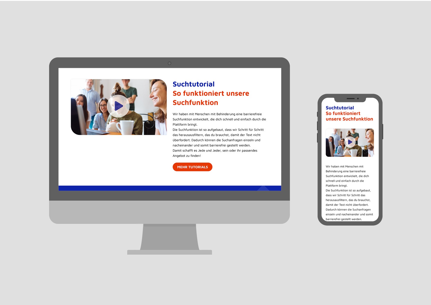
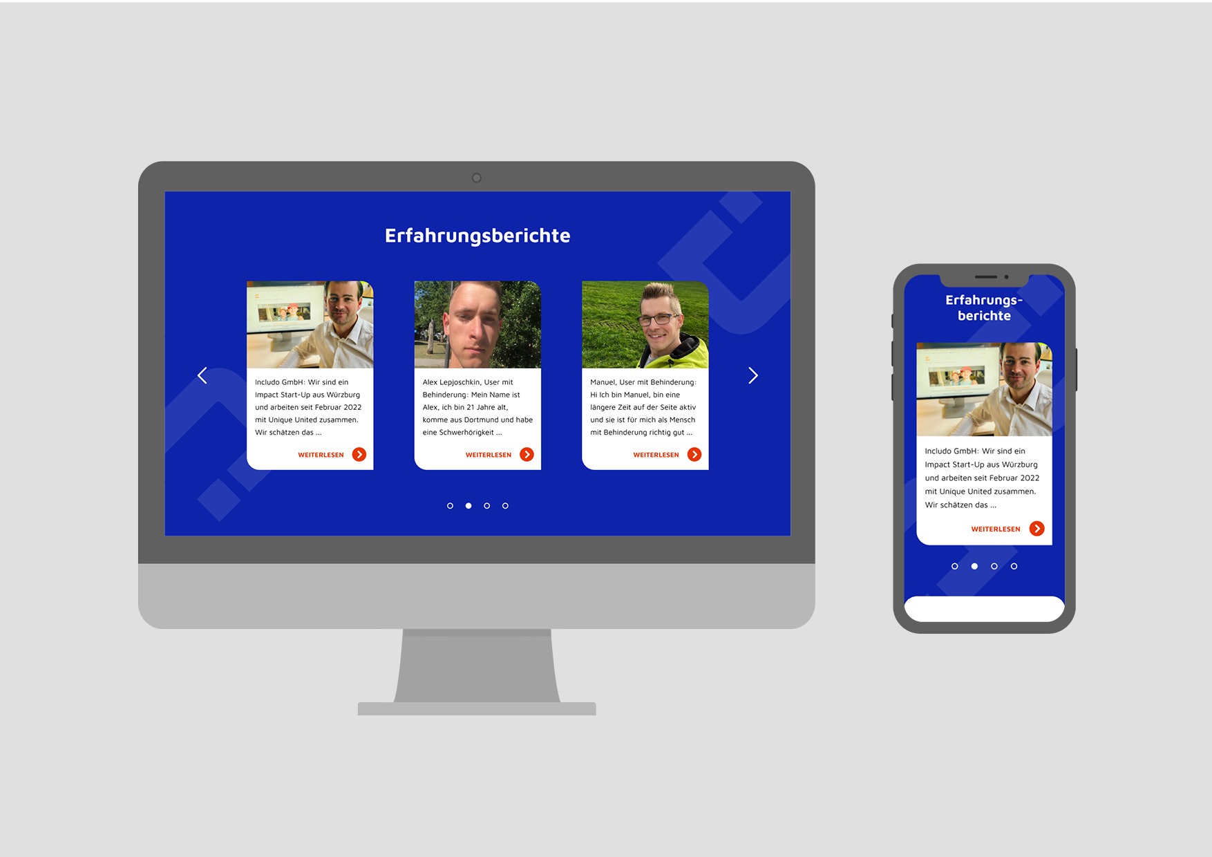
Should Have: Tutorials, information page, reviews, …
Nice to Have: Community forum, chat function, login area, …
User Flows

We have created a user flow for each individual action to ensure that we do not forget any important steps in the user experience.
With a user flow, an action (e.g. searching for offers) is divided into individual intermediate steps and decision options. This creates a process that the user has to go through in a digital product in order to achieve a result. (e.g. finding the right offer)

Sitemap
In the sitemap, we have listed all the pages and functions of the platform and arranged them in a hierarchy. It is a plan for navigation on the platform.
The sitemap helps to define how the pages and functions relate to each other. A sitemap brings structure and clarity to a UX concept, especially for complex products and applications.
Step 3:
Prototype development
Wireframes

Before developing a user interface design, I built the entire platform with wireframes. It is, so to speak, a draft of the individual pages and functions. This allowed us to plan and test which elements were needed and where they should be placed.
When designing the page structures and functions, I made sure that users can find their way around the platform quickly and easily. Since the target users primarily surf with their smartphones, the mobile view is the top priority.
Click dummy tests and optimization
Using a click dummy, we were able to test, check and optimize all functions and correlations. In addition to internal tests, Louis tested the pages with people from the target group. This enabled us to ensure that all the connections were correct and processes were logically structured.
Step 4
UI design
After the initial tests and optimization of the wireframes, we moved on to the development of a design guide and the UI design for the platform.
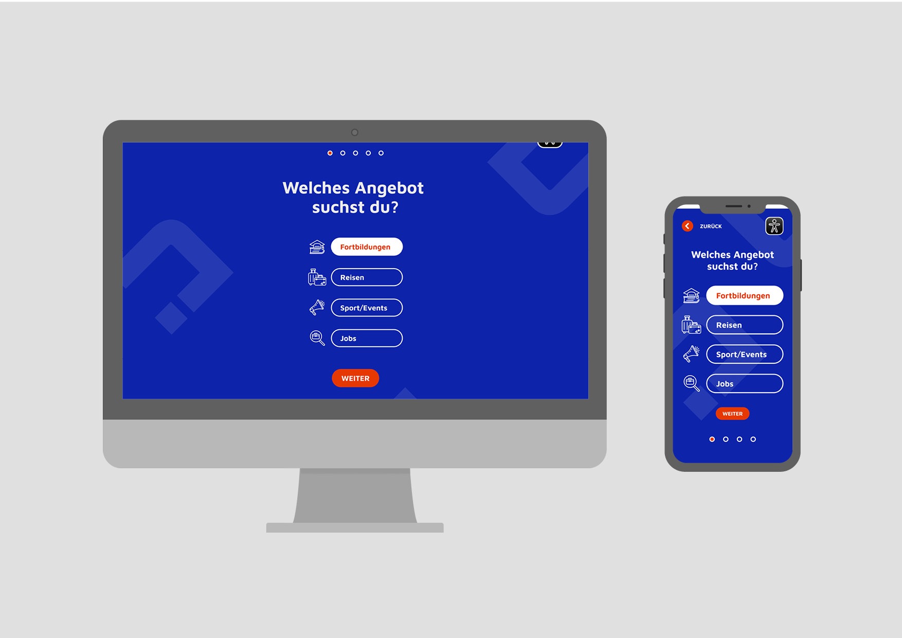
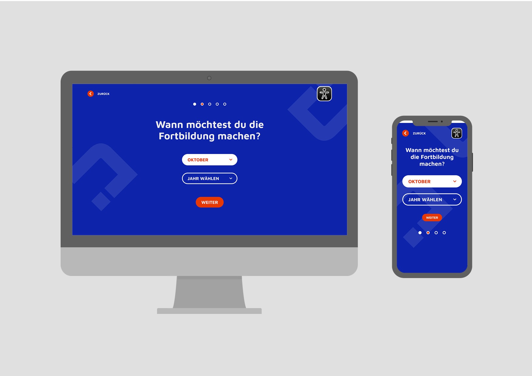
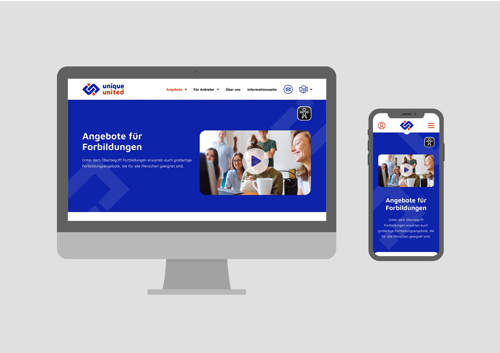
The design is modern and calm. The dark blue background color has a calming and appealing effect. In contrast, red is used as a signal color for the buttons and a few elements for highlighting.
The design is simple and minimalist. So that, as far as possible, only one piece of information is shown on the screen at a time.

Logo redesign
In the new logo, the letters and the logo symbol have a uniform shape. The colors are bold and modern and form a complementary contrast to each other.
Figma Design Guide
A design guide helps programmers to grasp and develop the design more quickly. It is important to define the design of the individual elements precisely and to bring them into a uniform form.
A design guide also helps to avoid programming errors. The clear specifications and dimensions should ensure that the UI design later looks exactly the same in programming as in the drafts.

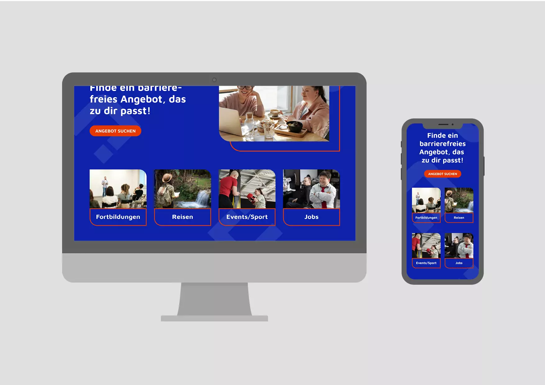
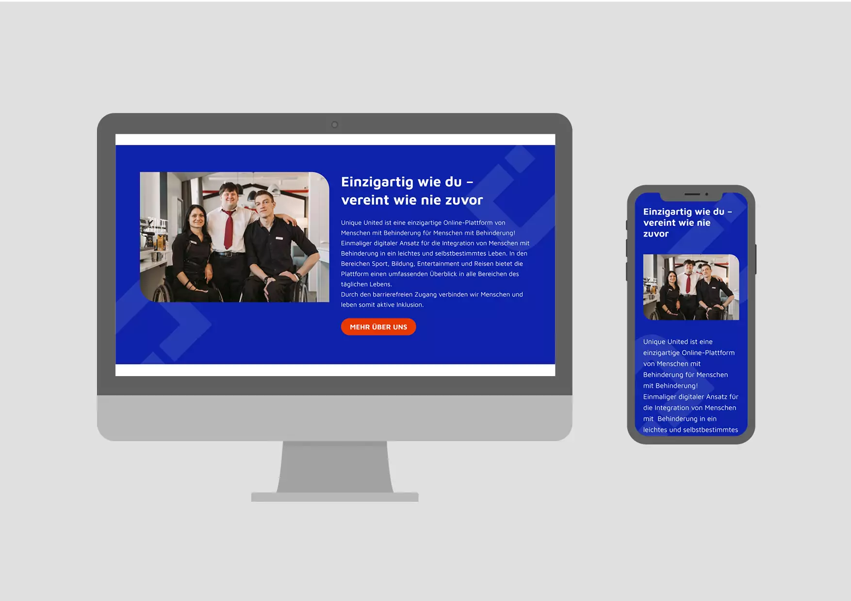
Home page

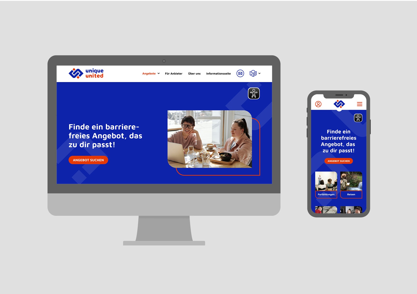
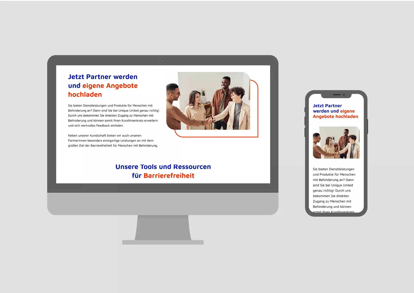
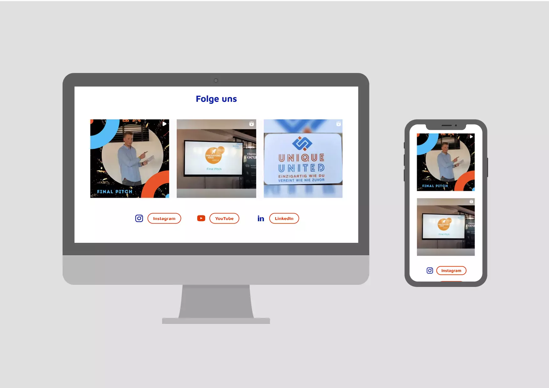
Step by step search


Offer overview

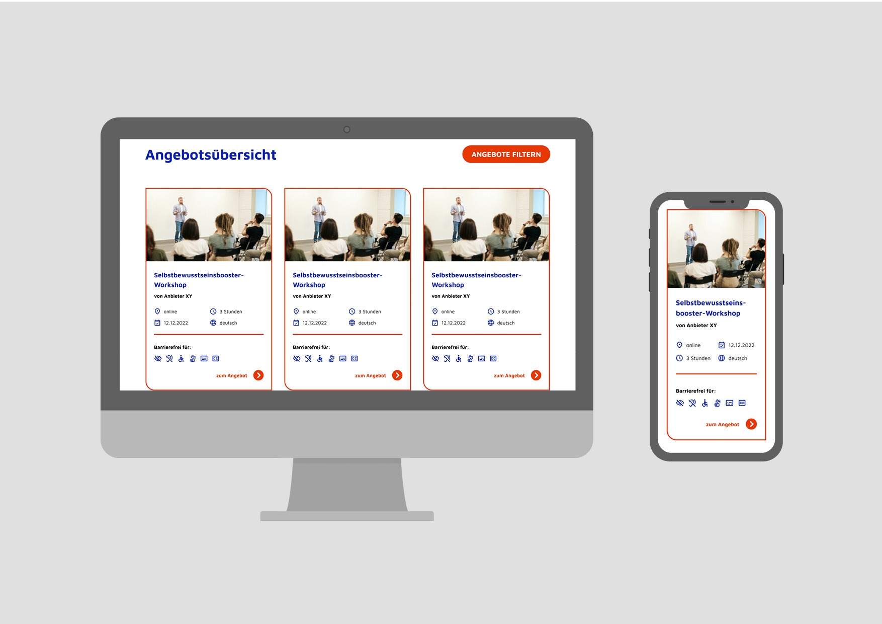
Offer page

Overview of the offers


Step 5
Programming
In a handover meeting, I briefed the programmer responsible and gave him all the concepts, designs and requirements. This allowed the initial questions to be clarified quickly.
I then continued to support the development of the site and was available for questions and possible changes.
Conclusion on accessibility

Many of the points for accessible design, if not all, are already mandatory for good UX / UI design! In the end, everyone benefits from an accessible app or platform.
The most important points for an accessible UX / UI design:
Simple and easy to understand navigation
Intuitive user guidance
Simple and clearly written texts
Large fonts and sufficient spacing
High contrast
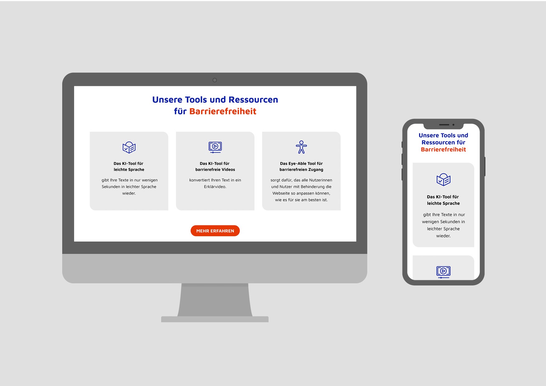
Visual and audio elements, such as images, icons and videos
Videos with subtitles
Images and icons with text alternatives
Of course, there are also a number of points relating to the technical implementation that become relevant during programming. These include the usability of the page via the keyboard, the ability to enlarge texts or the structure of the HTML elements. For this, it is important to get together with the responsible developers in good time. In the case of Unique-United, we have integrated the Eye-Able® tool, which covers all important functions for people with disabilities.