
redesign
FUNKE Academy
The FUNKE Medien Group needed a new design for its learning and management platform FUNKE Akademie.
Employees and users should be able to manage, search and book seminars, workshops and e-learning courses on the platform.
As an employee of rend Medien Service GmbH, I have redesigned the platform.
Methods & services
Analysis | Consulting | Workshop | User analysis | UX/UI design | Project management | Quality check
Challenges
The platform was set up in a prefabricated system that was not particularly appealing or clear.
Many of the functions were predefined and could only be changed with a great deal of effort.
A very tight budget and time pressure limited the possibilities for optimization.
Goals
The platform should become clearer.
The user guidance should be improved.
The user interface should be more appealing and clearer.
Project phases


UX / UI workshop
Together with the Funke Media team and the project managers, we analyzed the usage problems of the old platform in a workshop.
I was able to use my experience to advise the team and suggest changes for a better user experience.
Step by step, we worked out all the possibilities for fast and effective optimization. The next steps and tasks for development were set out in a plan.
User analysis
The Funke Academy has two users:
The manager should be able to manage bookings, approvals and employees.
Employees should be able to search for and book seminars, workshops and e-learning courses as easily as possible.
Primary view during use:
As the platform is primarily used professionally, all pages and functions have been optimized for the desktop view.


UX design
There has already been a lot of feedback and queries about using the old platform. The application difficulties and questions were often repeated. This allowed me to make many optimizations to the user experience based on user needs.
Users had problems finding their way around the old platform. Many of the buttons could not be found or were not understood.
UI design
Dashboard
A clear dashboard with clear call-to-actions and a better overview.


Learning offers


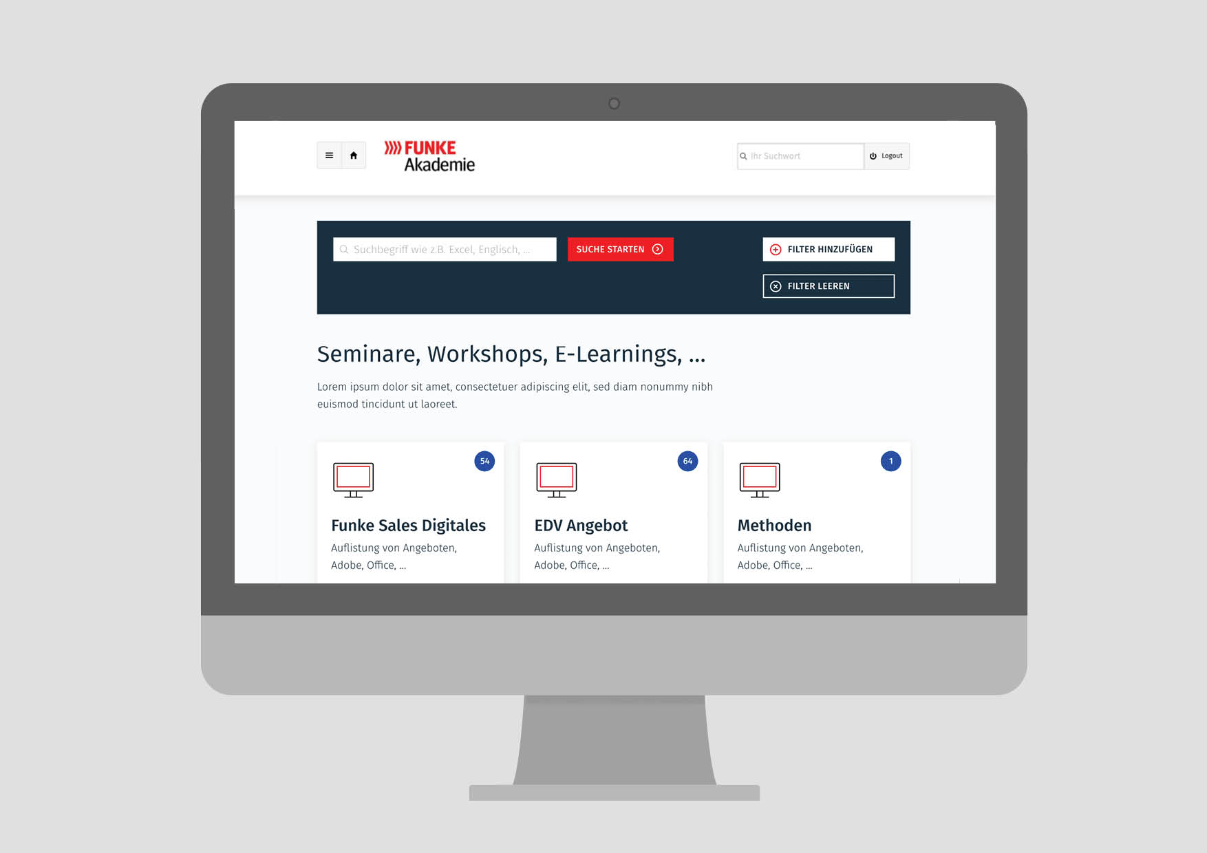
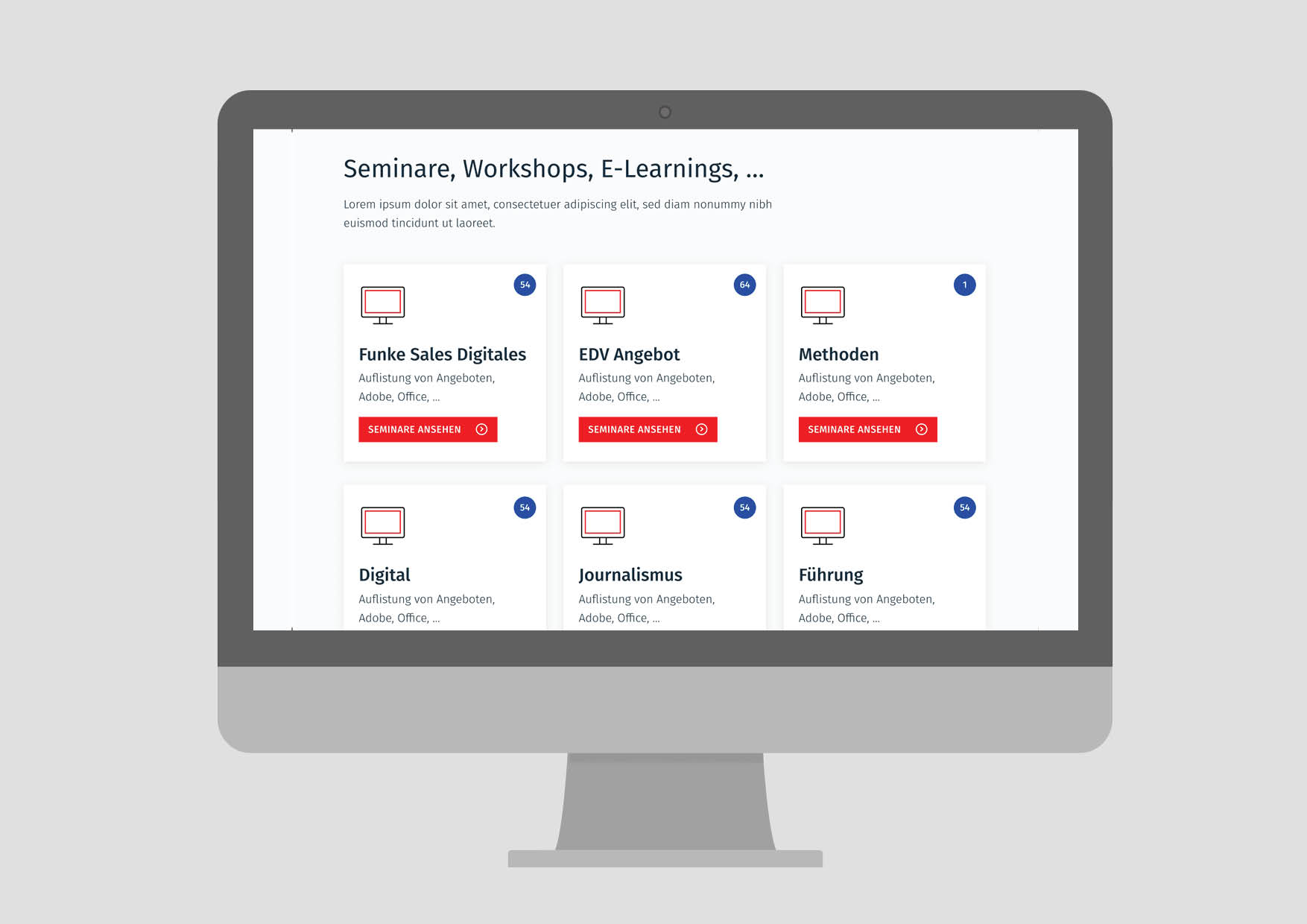
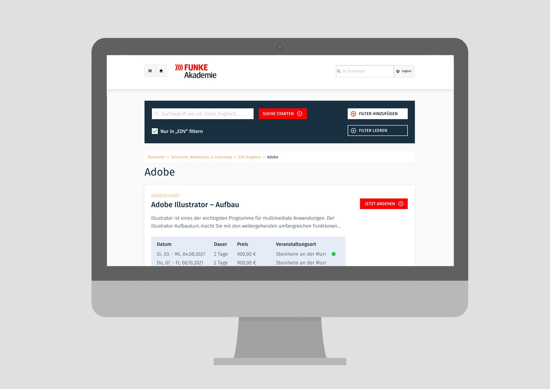
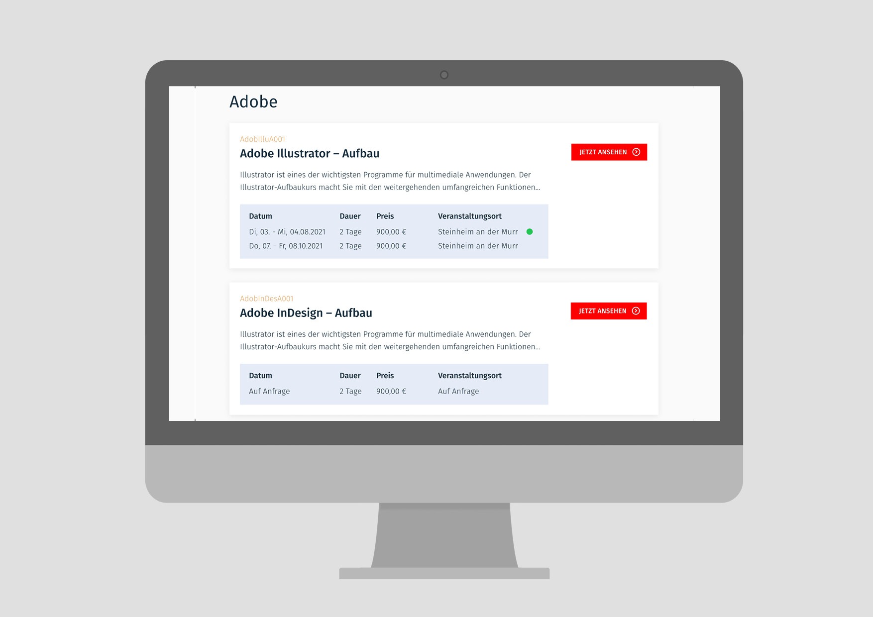
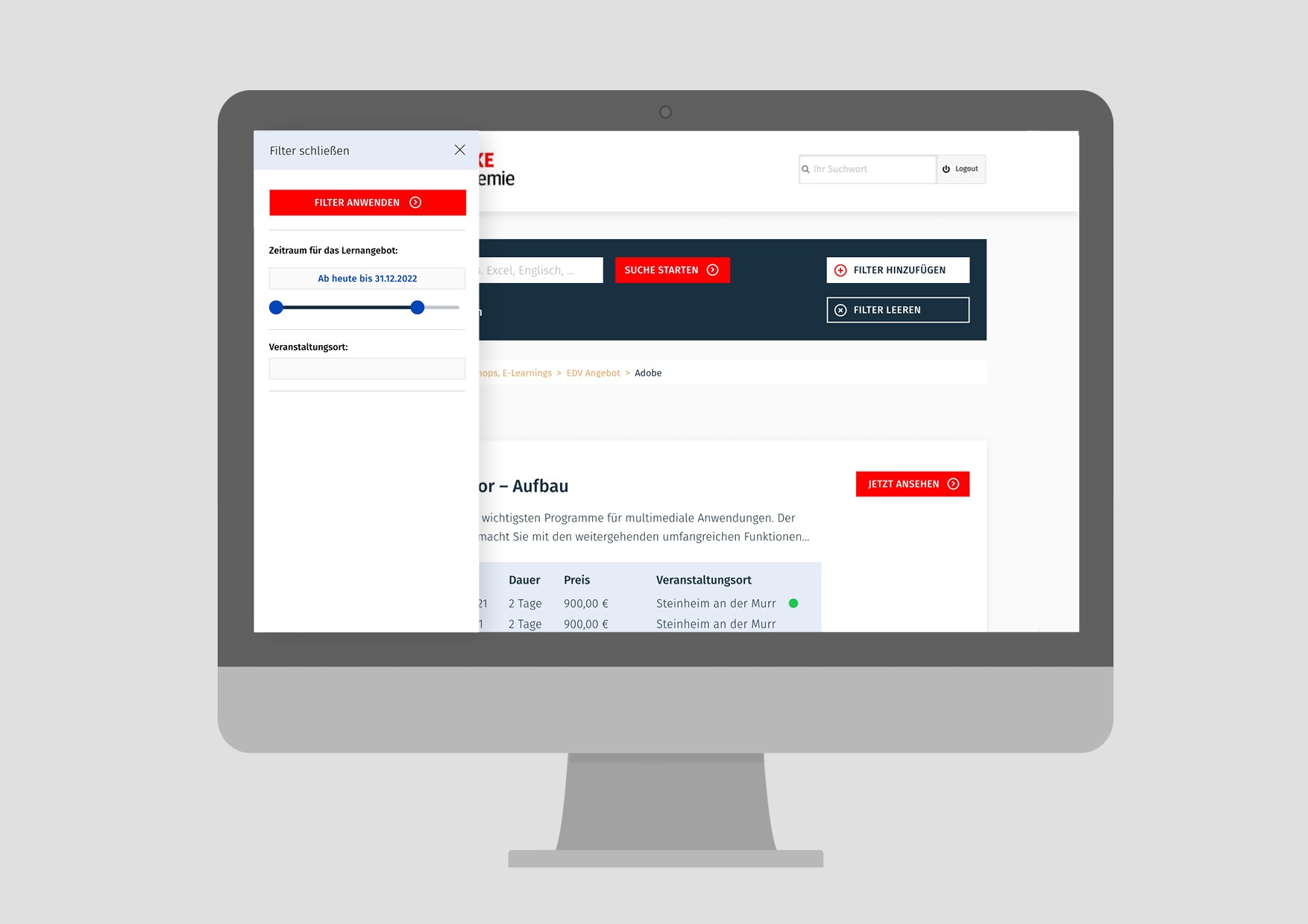
Overview page


Registration form


Implementation and quality inspection
Together with the developer of the basic system and a front-end developer from my team, I coordinated the implementation and ensured the quality of the new platform.
Conclusion
With little effort and a quick implementation, we were able to make the platform clearer and more appealing within a few weeks. With call-to-actions and a clear structure, users can now find their way around the platform more quickly and manage their seminars and workshops.
