
ux/ ui design relaunch
e-learning for occupational safety
The rend e-learning platform offers companies various courses on the subject of occupational safety. The ready-made courses can be selected individually and in 5 different languages. Blog articles, instructions and documents tailored to the user can also be added.
For a redesign, I worked with the programmers to develop a new menu navigation, a better user experience and a new UI design.
Methods & services
Analysis | Consulting | User Research | UX Design | UI Design | Design Guide
Challenges
Many different pages and sub-pages should be brought together.
All overviews should be displayed as table and tile views with many different elements and information.
The design colors and logos should be able to be changed individually by the companies.
Limited possibilities in the structure of the pages and functions.
Goals
Simpler menu navigation.
Better overview of current training courses.
More user-friendly functions and processes.
Attractive and user-friendly UI design.
Project phases

Project Kick-Off
The requirements and specifications for the new e-learning platform were discussed in a kick-off meeting and open questions were clarified. The submission deadlines and process were then discussed.
User analysis
Users belong to a company that assigns them access and courses on the topic of occupational safety. The platform and the courses are primarily used by users who work in the office. There are two different user groups.
Administrators:
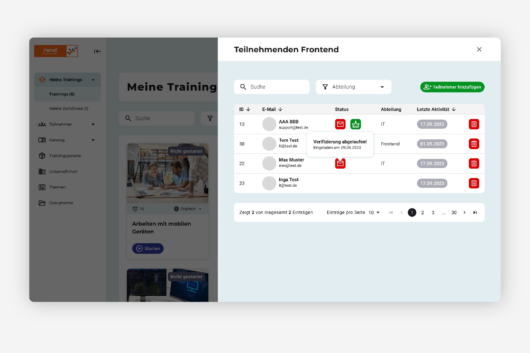
Every company has one or more users who are responsible for setting up and assigning courses and accounts. They should have a good overview of all participants, the status of the courses held and the ability to assign courses.
Employees:
Employees must complete the assigned courses within a certain period of time and have a certificate. They should have a good overview of their current courses and certificates.
Primary view during use:
The platform is primarily used via a desktop or laptop. As a mobile solution, the platform should also be easy to use on a tablet.
An app for mobile use is to be developed in the future.


Competitor analysis
Direct competitors are the Haufe Academy and Weka E-Learning, which also offer courses on occupational health and safety.
To set the platform apart from others, it was important to create better user guidance and an appealing and modern view.
Platform analysis
The e-learning platform is already being used by over 10,000 users from 5 different countries. The feedback from companies and users is already very good. The navigation and some functions were not entirely clear and user-friendly before the redesign and should be revised.


UX design
Based on the analyses after consultation with the developers, I revised and optimized the menu navigation, a few action sequences and the user interface. First and foremost, the platform should be clearer and easier to use.
UI design
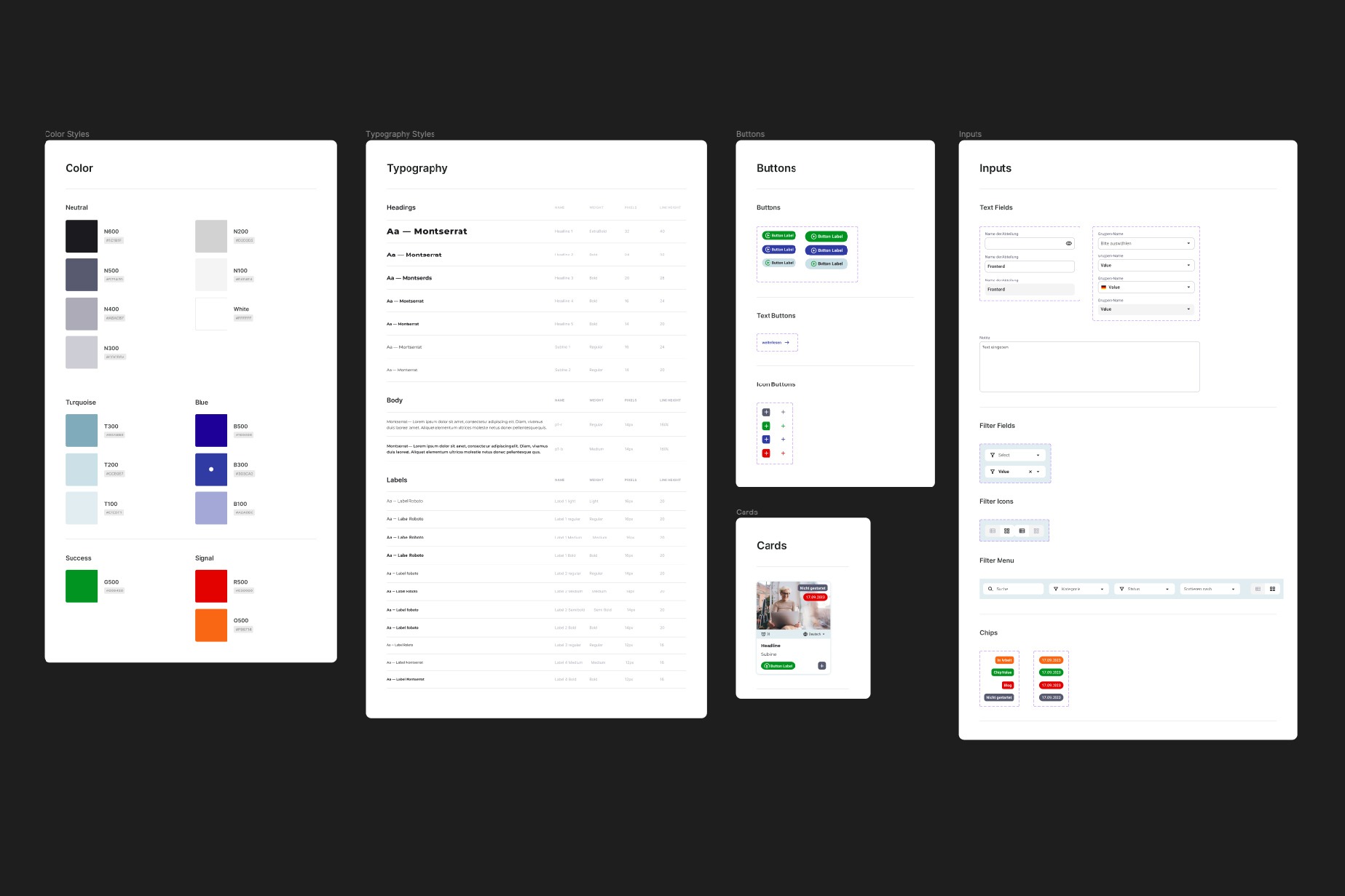
Style guide
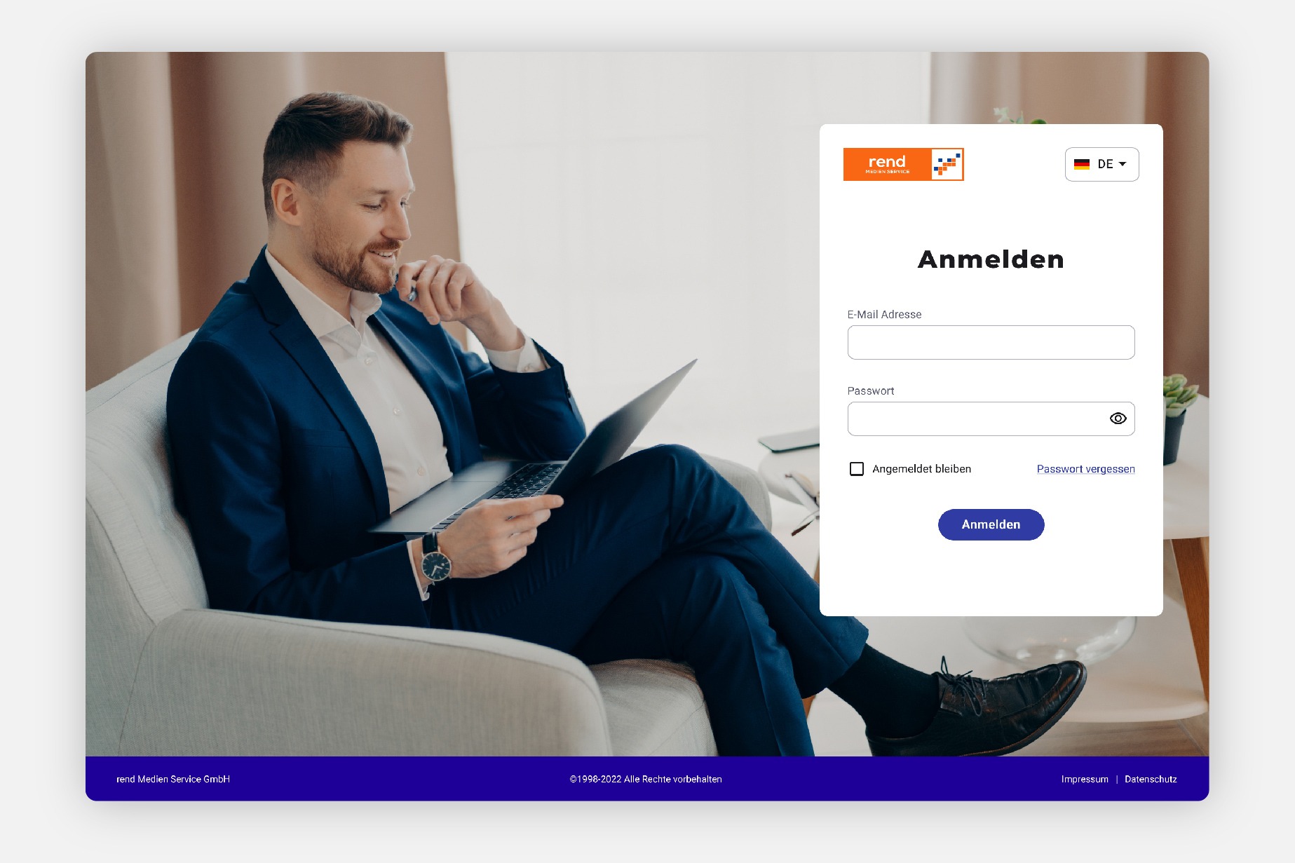
Login page
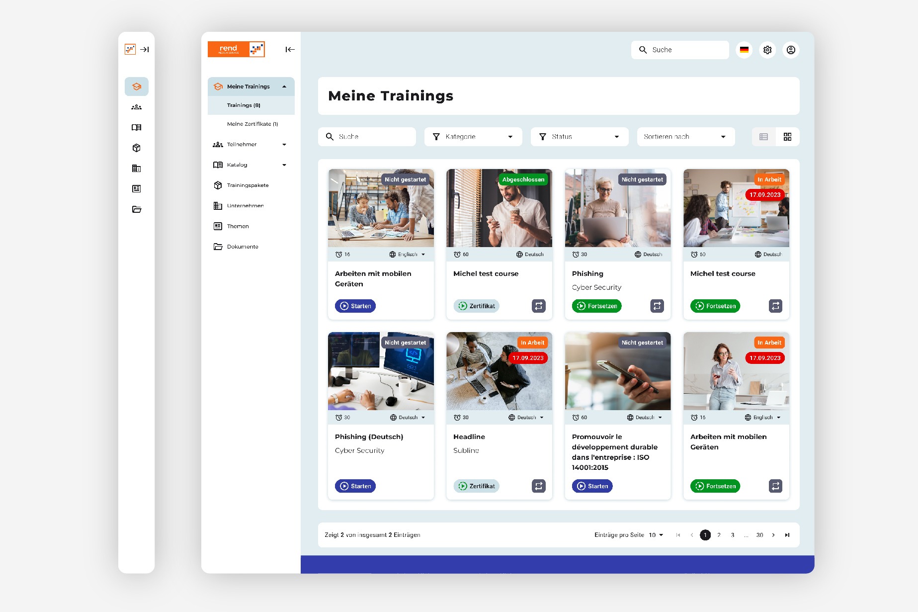
Menu guidance
Color variant
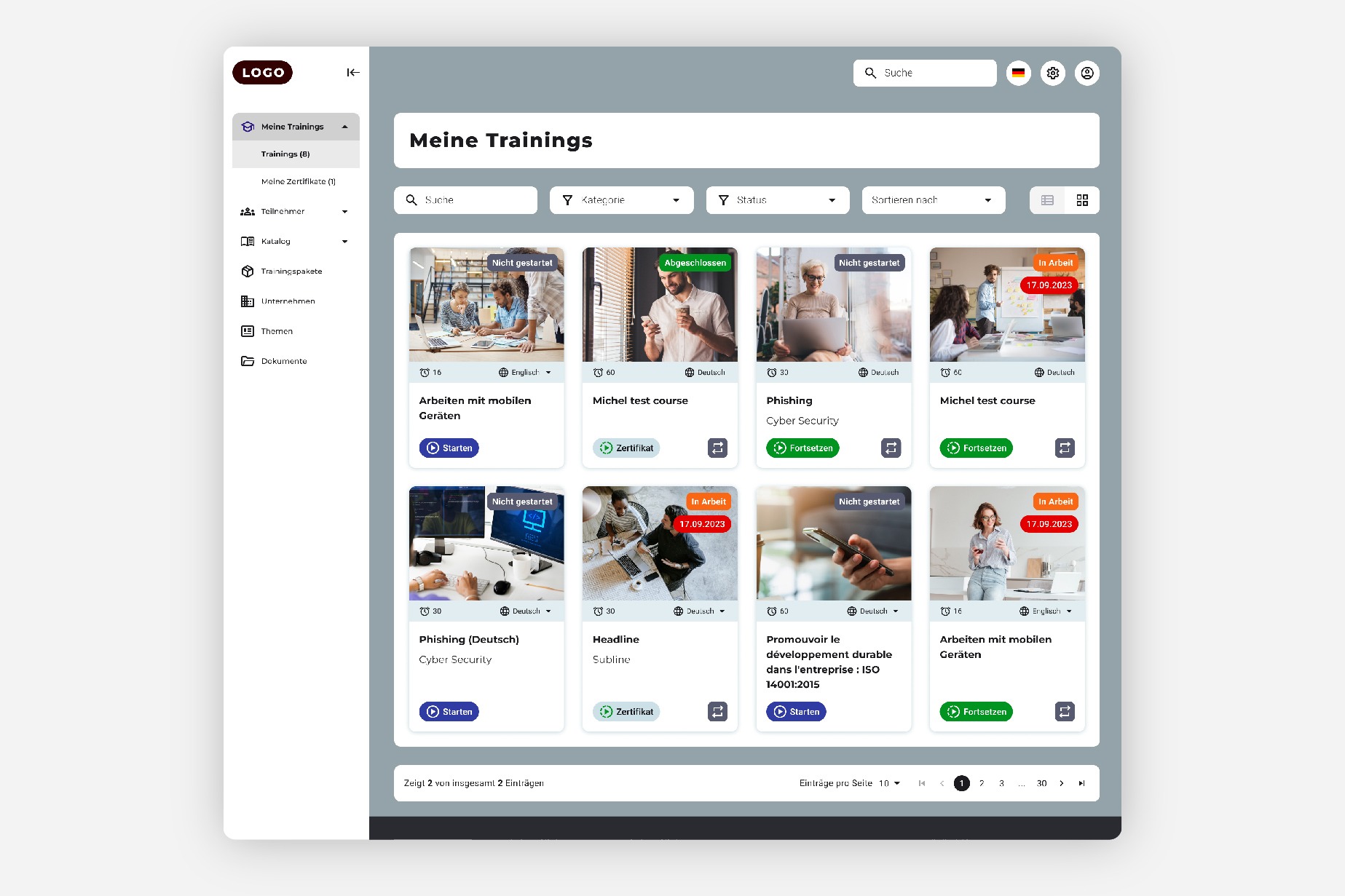
Training overview
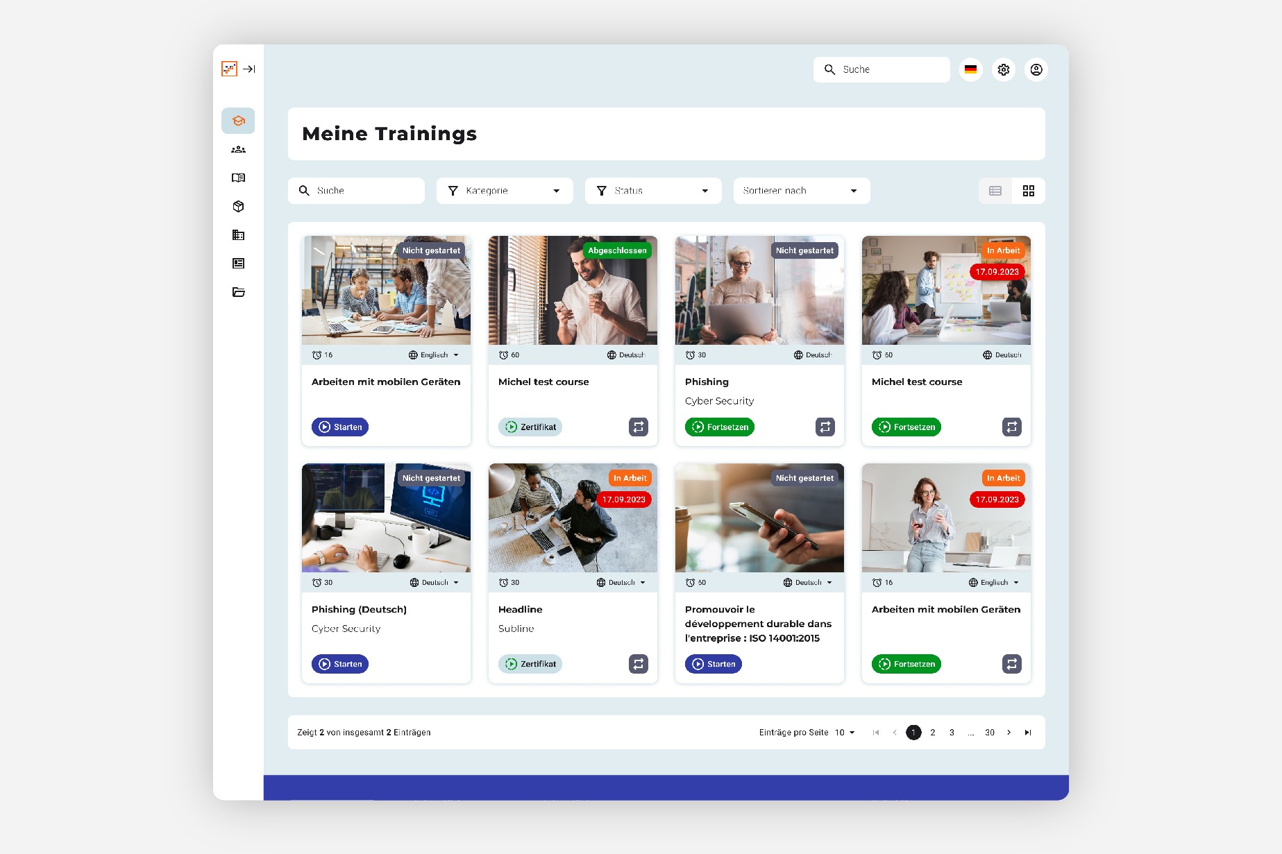
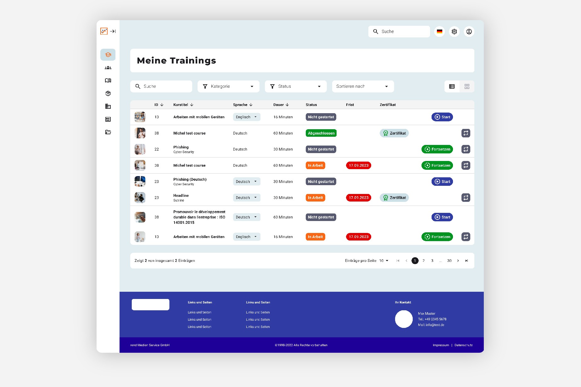
Filtering
Manage course participants
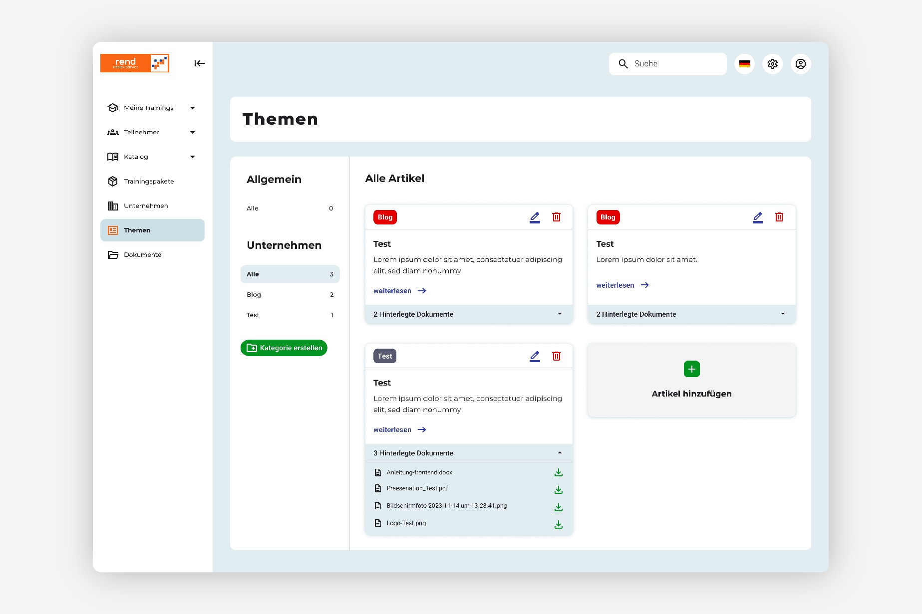
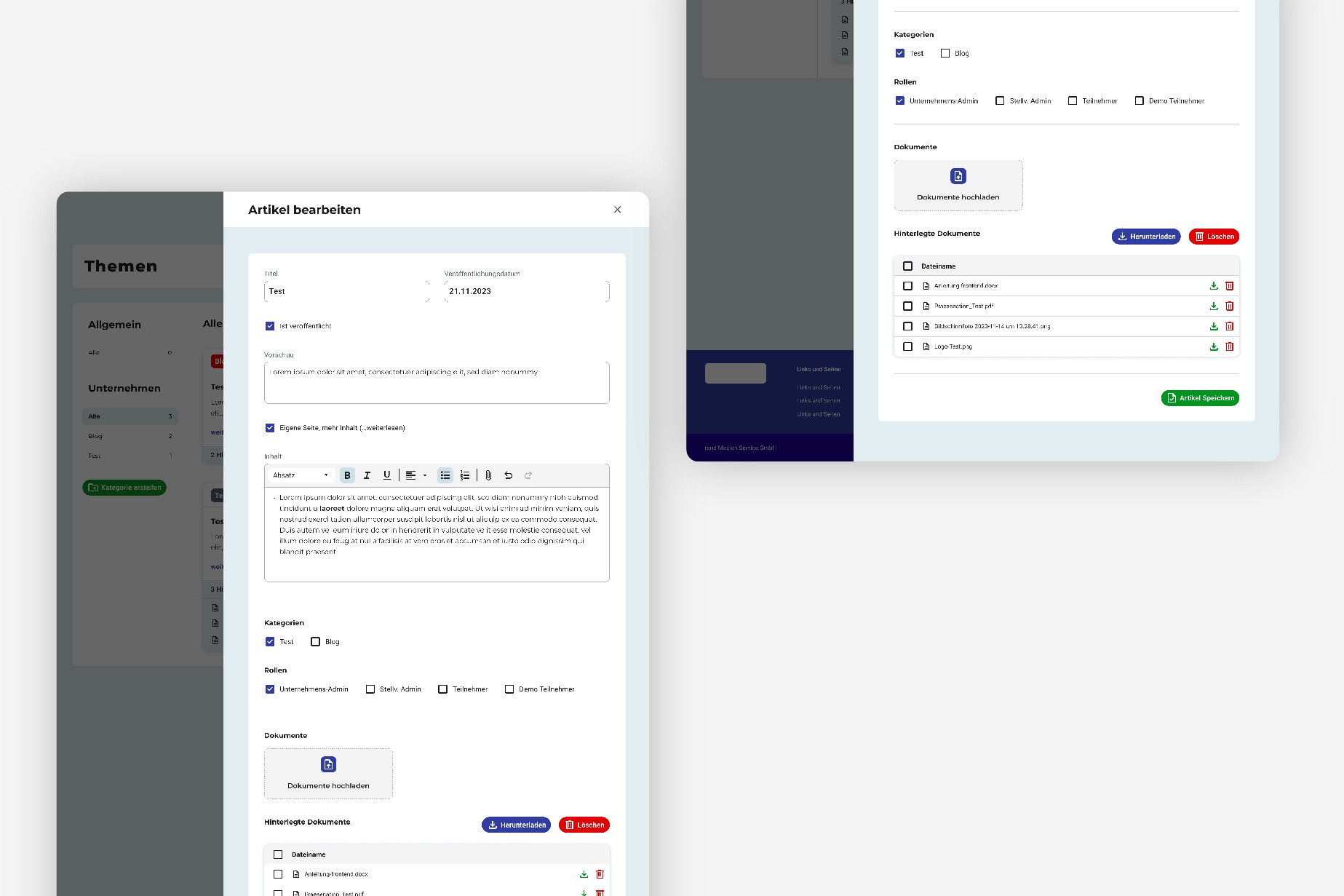
Create article
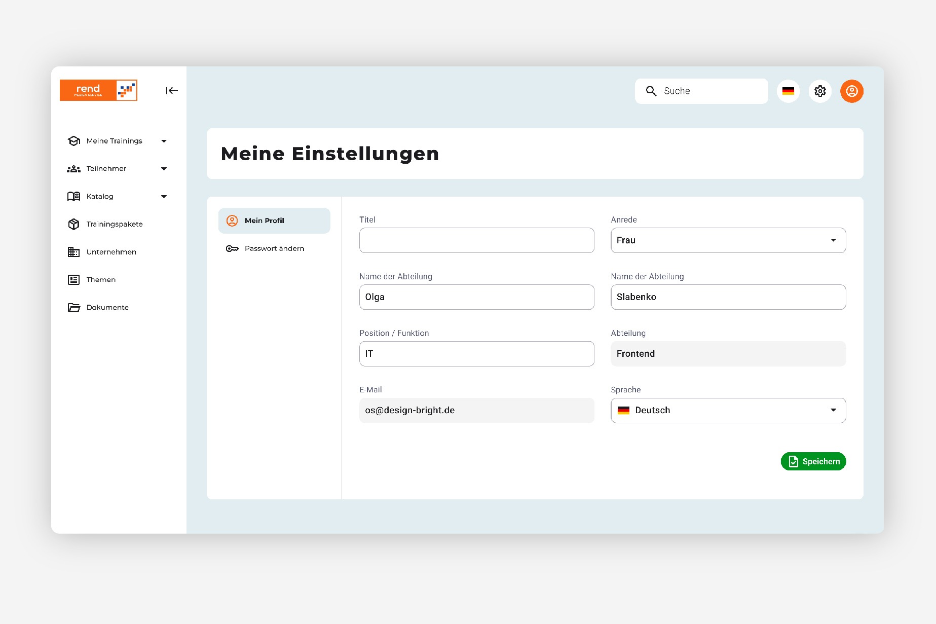
Settings
Conclusion
The new e-learning platform offers a better overview of the courses and clear navigation through the individual pages. Filtering is more user-friendly and administrators can manage the courses better. Above all, the platform has become more visually appealing.


