
ux/ ui design pitch
E-learning platform
For a pitch to build and design an e-learning platform, I was asked to create designs for dashboards that were modern and clear. The users should find their way around quickly and feel addressed by the design.
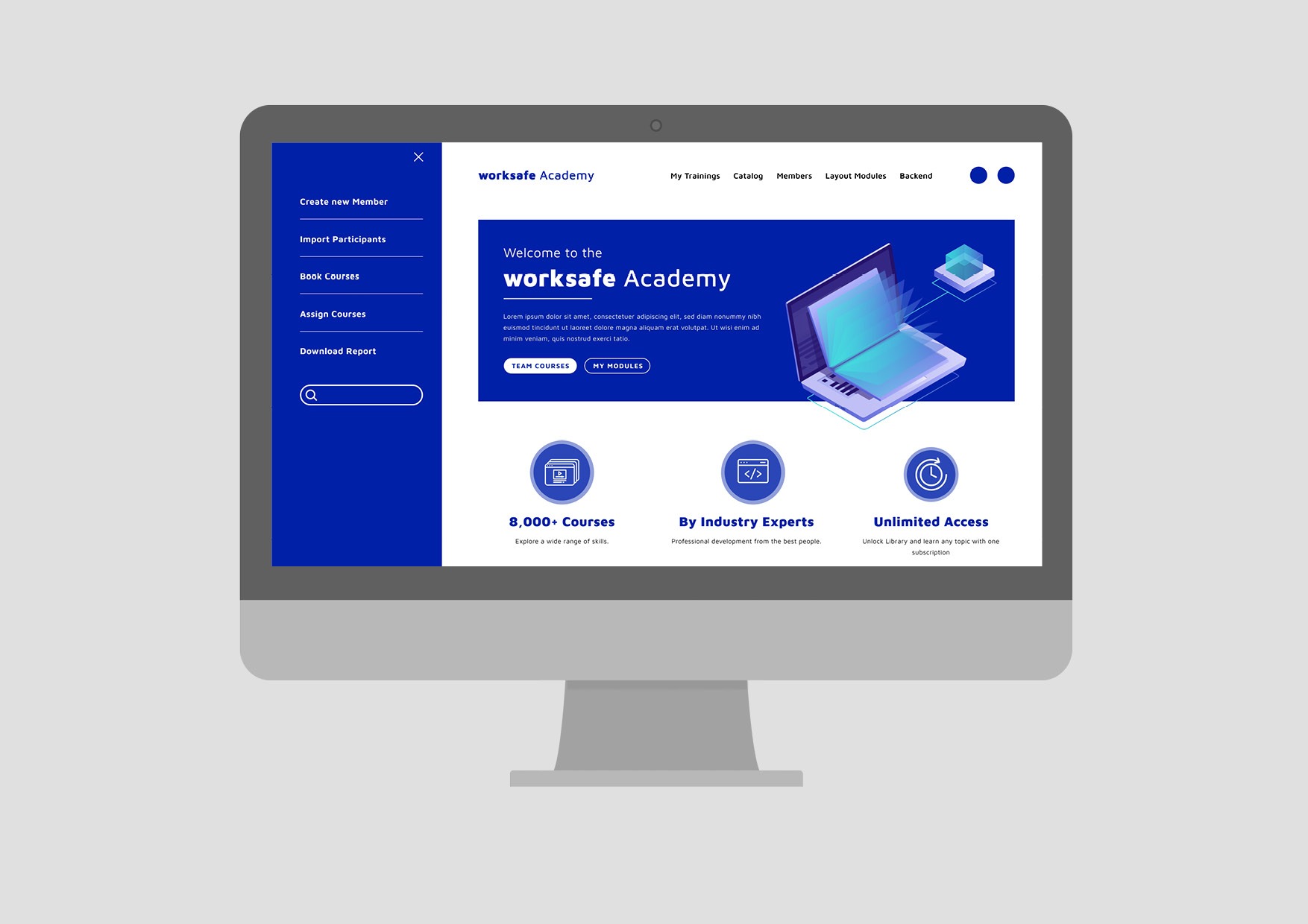
I designed two variants for the start page with dashboard and a subpage for the learning process.
Methods & services
Analysis | UX design | UI design
Challenges
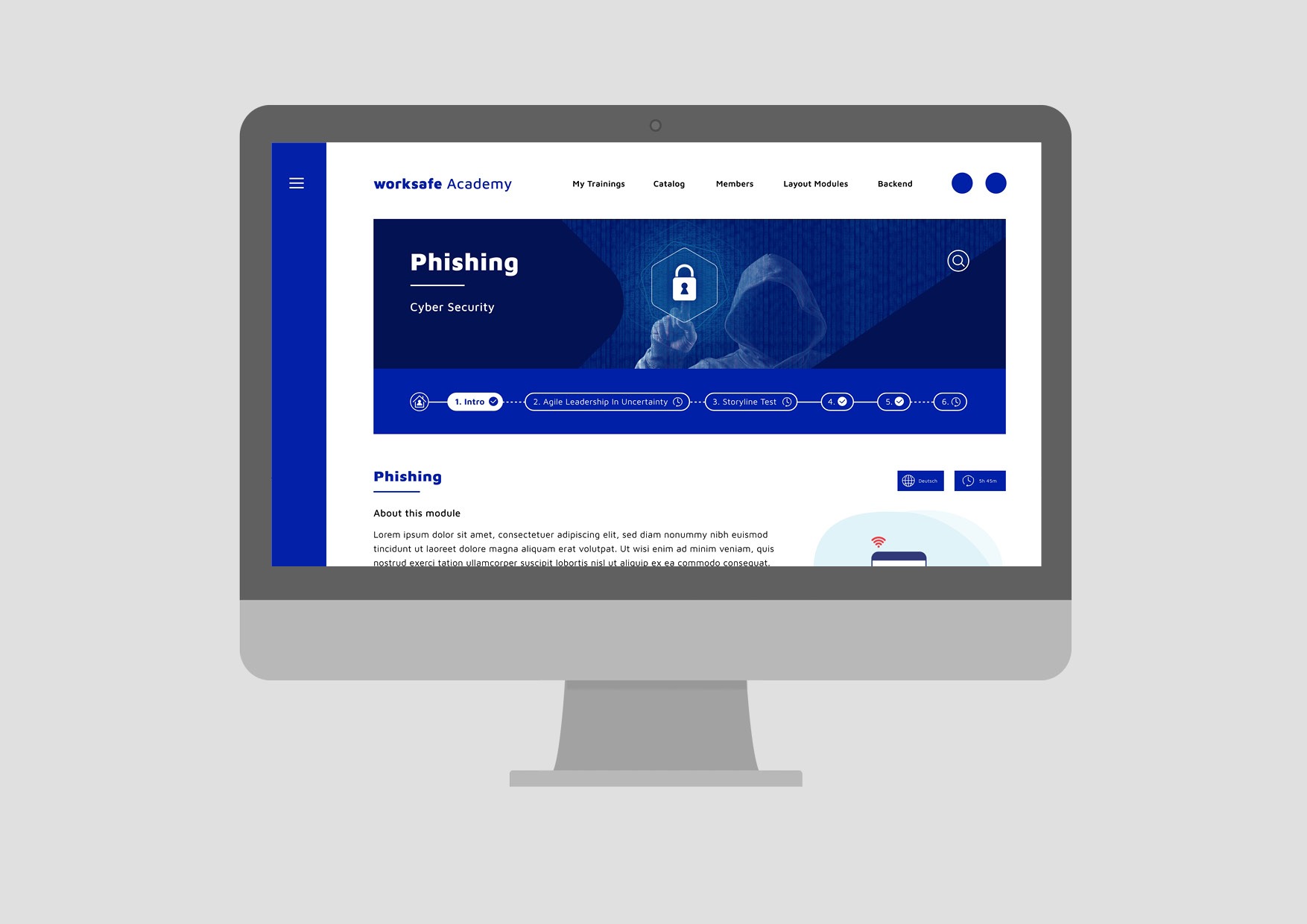
The main navigation had to remain horizontally at the top.
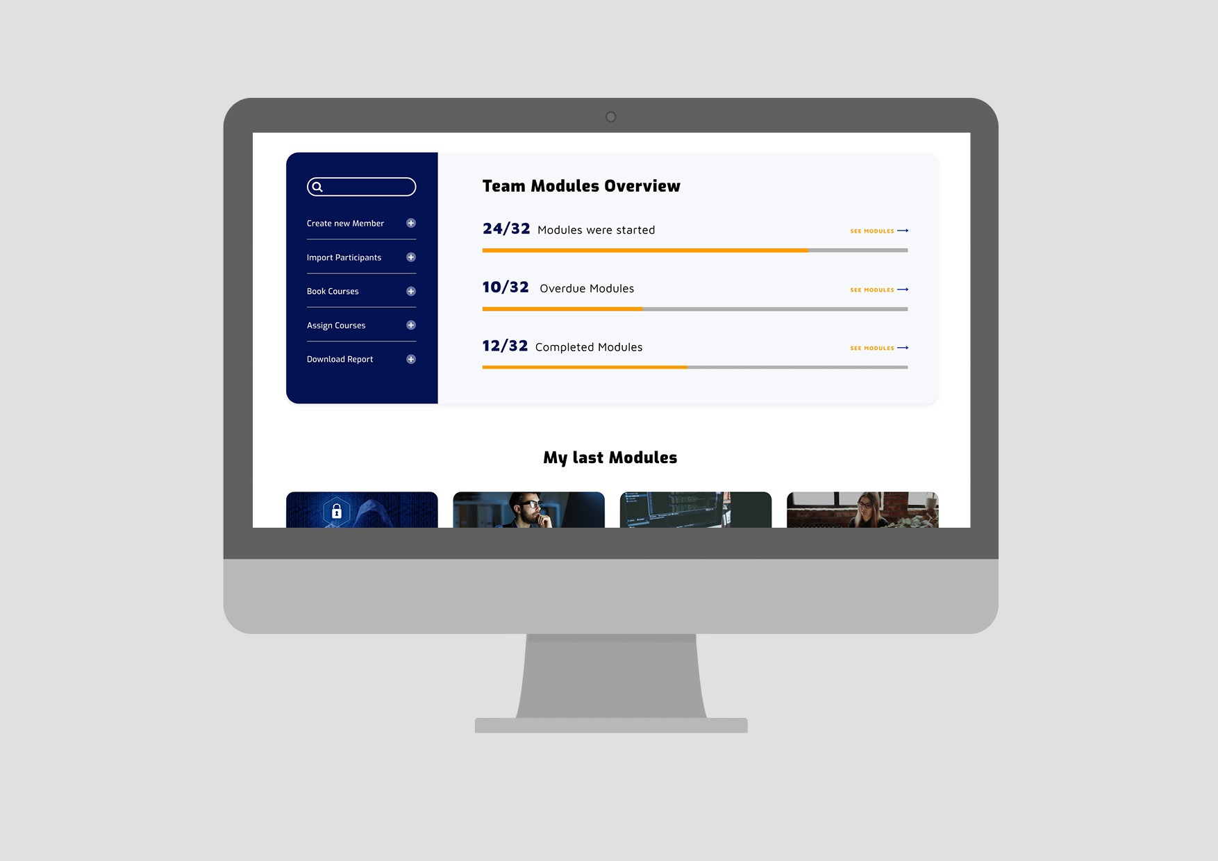
The view of the course manager should be combined with the view of the “learner”.
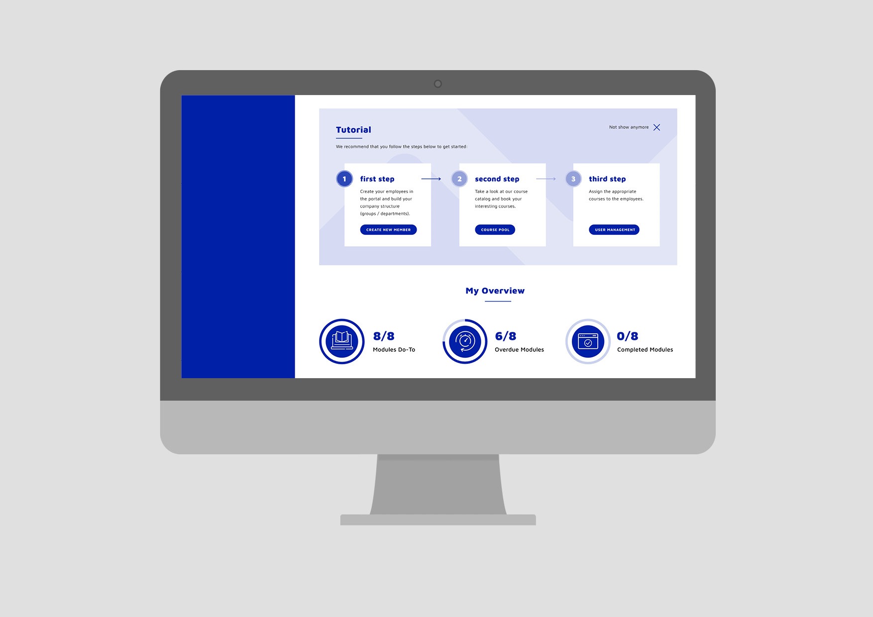
Explanation and advantages should be emphasized.
Goals
Quick overview with all important information.
Simple and clear user guidance.
Modern and attractive design.
Project phases


Project Kick-Off
The requirements and specifications for the new platform were discussed in a kick-off meeting and open questions were clarified.
User analysis
The e-learning platform has two users:
The course manager should manage the courses and assign them to his team members. They should also ensure that all important courses are successfully completed within the specified time.
The team member should be able to keep track of their courses and deadlines and run the courses easily.
Primary view during use:
As the platform is primarily used professionally, all pages and functions have been optimized for the desktop view.


Competitor analysis
The e-learning platform has a lot of competition both in Germany and internationally. In order to set the platform apart from others, it was important to create better user guidance and an appealing and modern view.
Platform analysis
Based on the user and competitor analysis, I examined the old platform and got an idea of the functions and possible problems with the user experience.


UX design
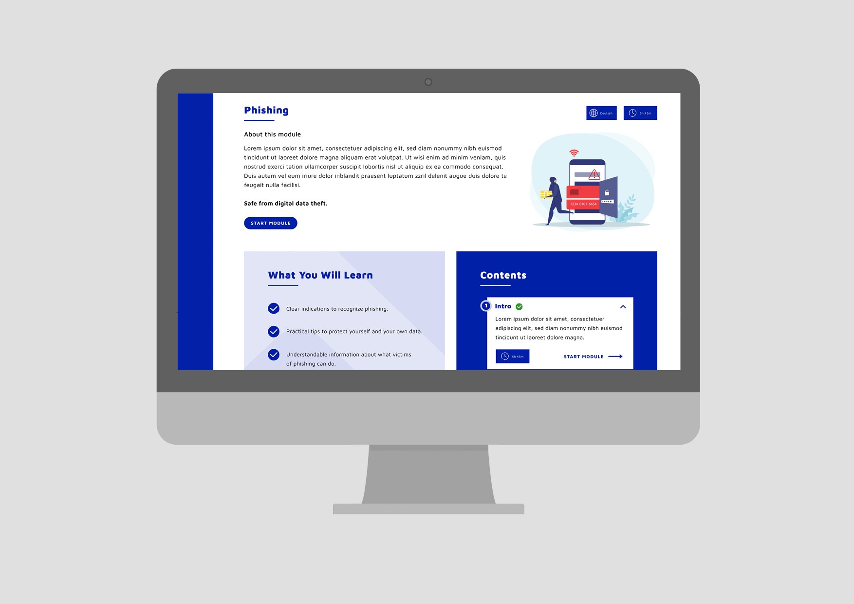
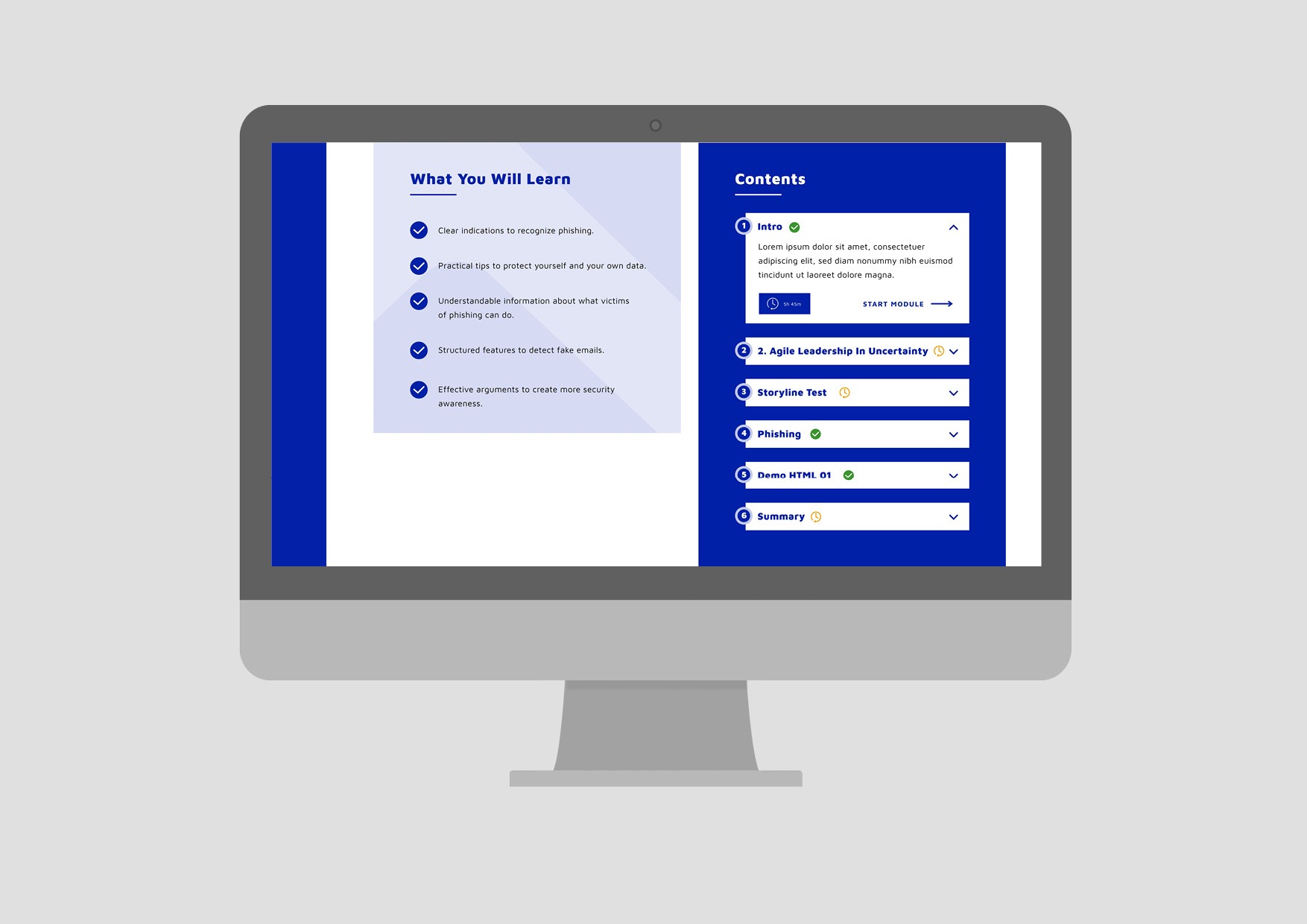
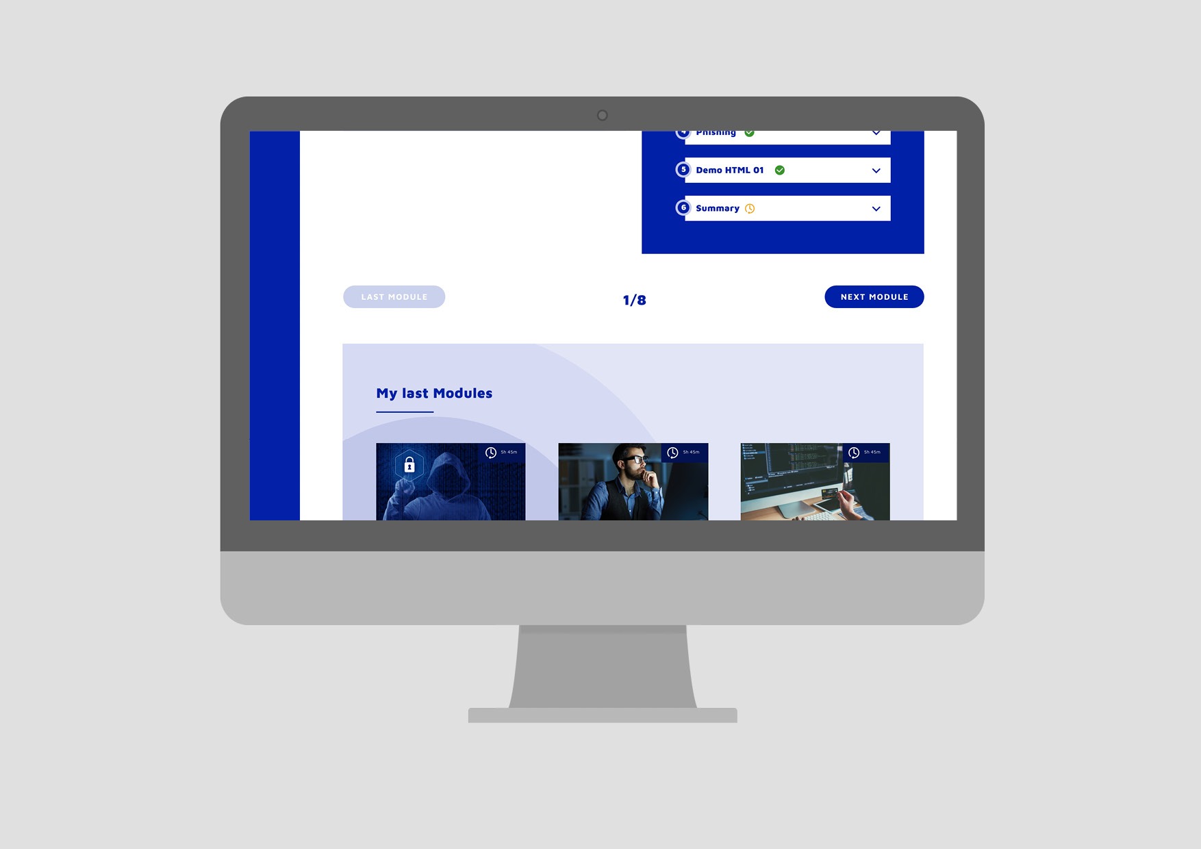
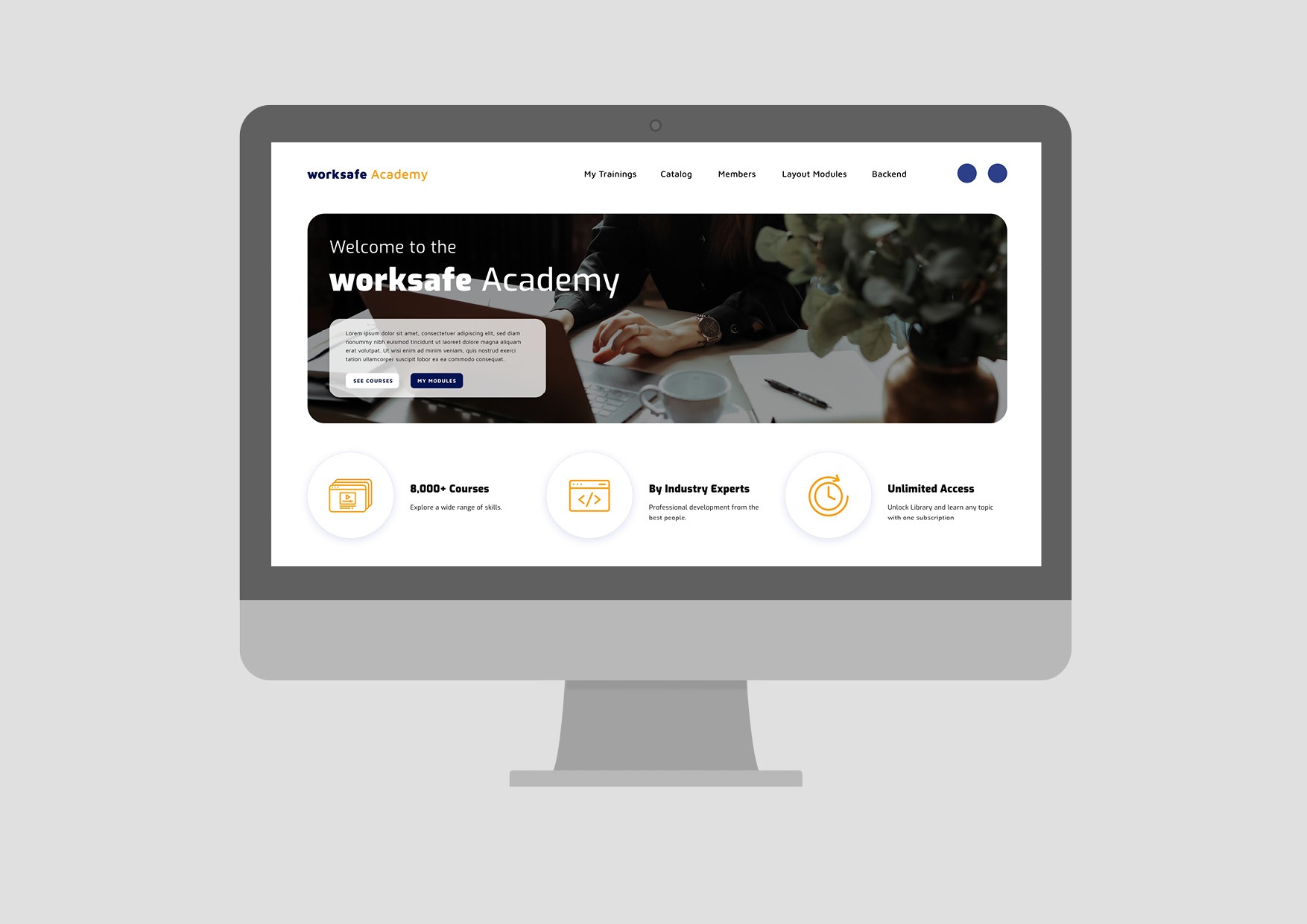
Clear call-to-actions should help users to quickly find their way around and navigate to the most important views.
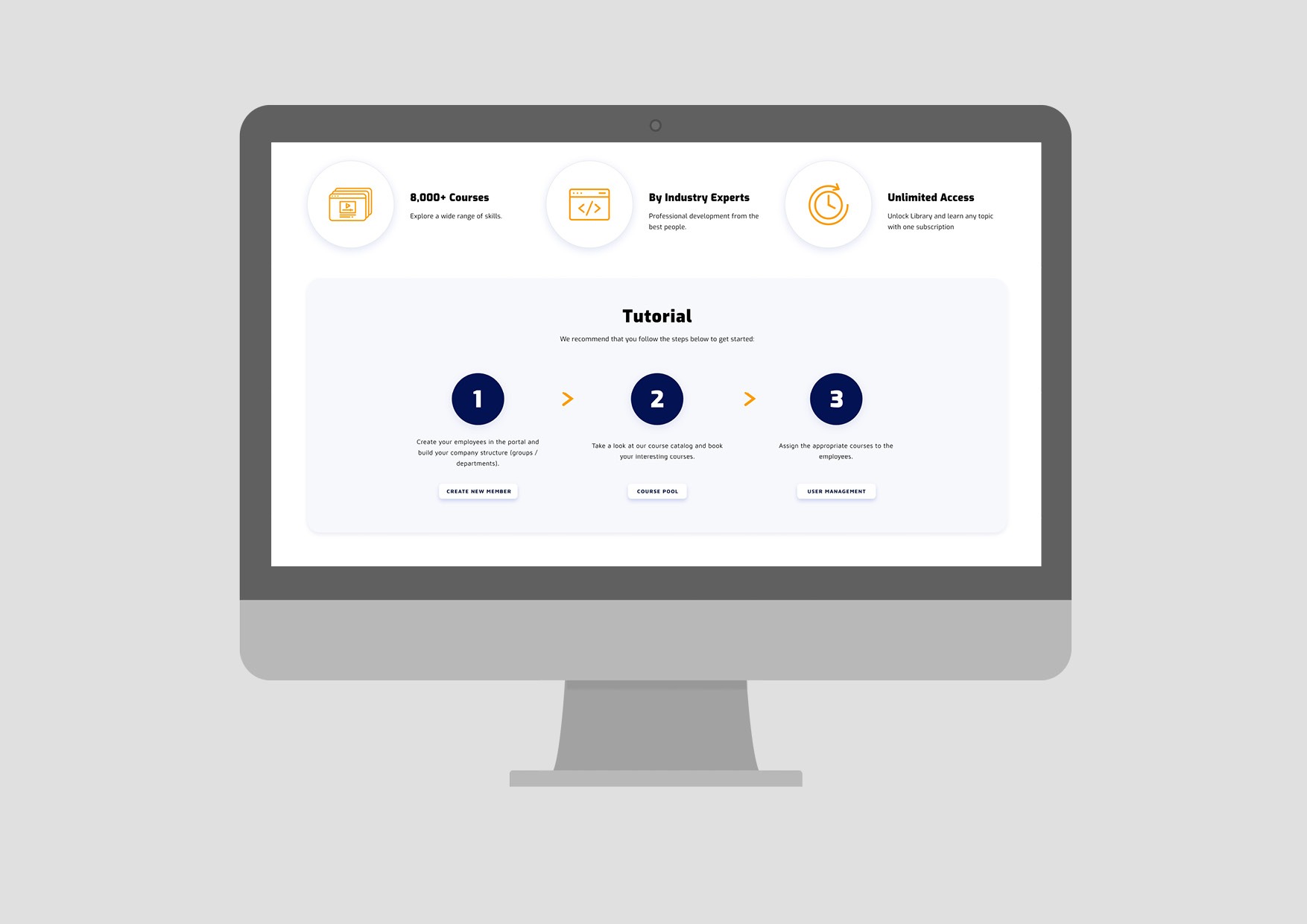
The platform should be as easy to use as possible. With step-by-step instructions and infographics, users have a good overview in which all questions are clarified.
UI design
Home page

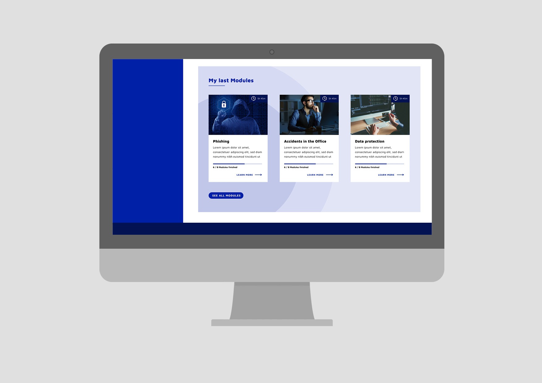
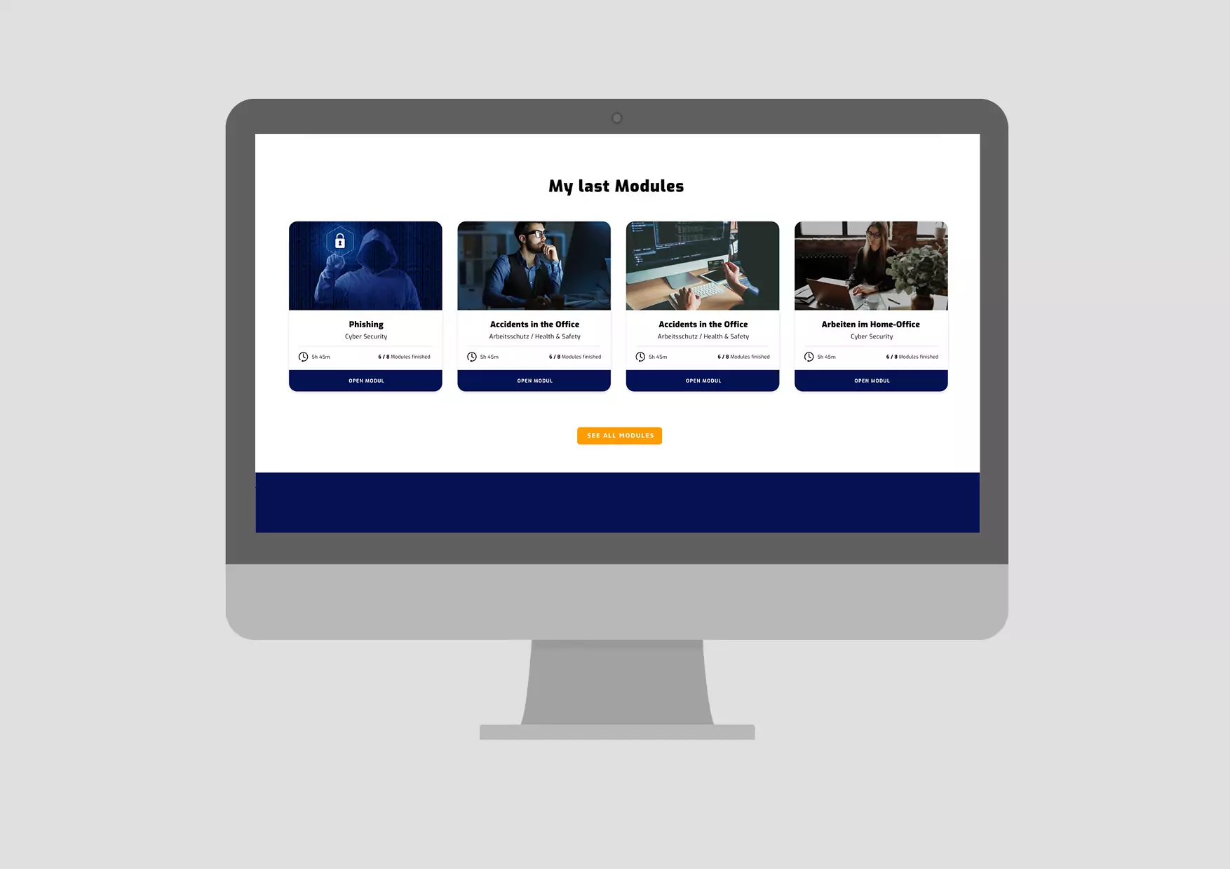
Module view

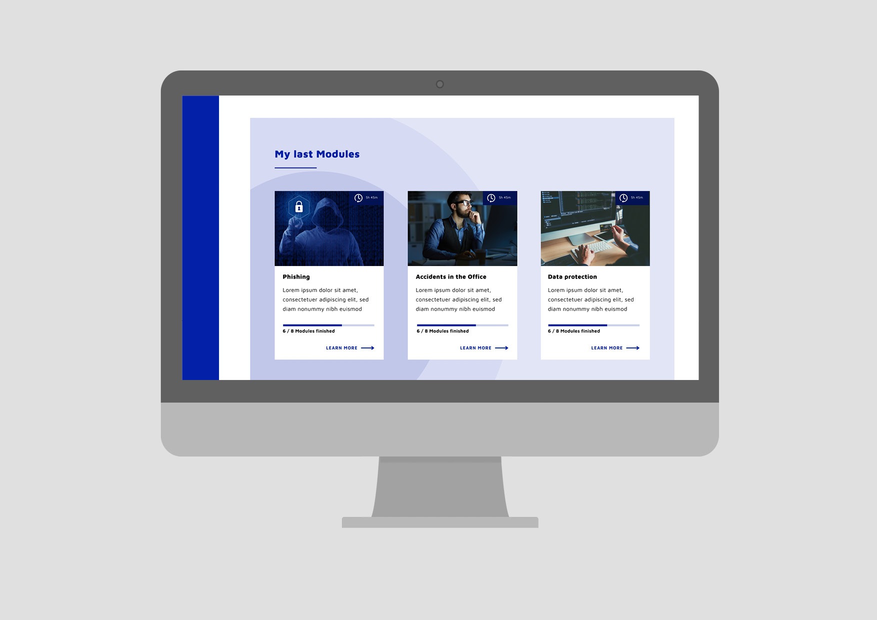
alternative homepage

Conclusion
Thanks to call-to-actions and clear navigation, course managers and team members can quickly access the desired views. At the same time, the information and benefits remain present and promote the platform.
